24 July 2006

How I Got Sore Hands

This is why my hands hurt: 


In the course of my work as an illustrator, I create somewhere between 35 and 50 maps like this per year, and I've been doing this type of detailed digital work since 1986. No wonder my hands hurt! In addition, I often forget to take breaks and I tend to press fairly hard on the keys and mouse. Oh yeah, and I draw with a mouse, which is like drawing with a bar of soap, but now I'm used to it and have had to retrain myself just to use a pencil. Sad. But I'm very stubborn and I want to do moku hanga, so I will not allow sore hands to deter me. 

Got a good tip from Tom K. the other day about using a large clearing chisel and mallet instead of my smaller hand tools, so I've ordered one. 

I heard a great interview with John Maeda on Design Matters last week. John Maeda is a well-known graphic designer, visual artist, and computer scientist at the MIT Media Lab and he talked about his own repetitive stress injury and the effect it's had on his work. He says that he's basically in pain all day long now, and as a result he tries to put no more than 3 hours of construction time into the majority of the pieces he creates. I don't say much about it, but a lot of my "laziness" around woodblock -- my not wanting to carve anything with painstaking detail -- is because of the pain in my hands. Fortunately for me, the pain isn't constant the way it is for Maeda. Maeda also said, "I've gotten tired of computers. They're too complex. Computers don't operate in a humane, cooperative way." This from a guy at MIT Lab! I completely agree, even as I live a life that only computers can afford me -- self-employed with the luxury of being able to live anywhere I want to live as long as there's electricity and Internet.

22 July 2006

Attitudes: Position 1

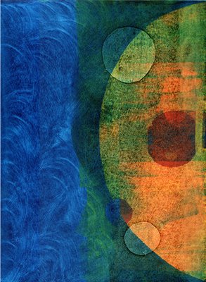
This is the finalized print. The original photo of the pose made me think of someone pushing against something really immovable, like trying to move a mountain. So I thought of rocks. And then, as I began to sketch, they became floating rocks. As the print evolved, I wanted to see the rocks look both heavy and light, so I made them transparent. Here are the steps to the final. 1) I printed the figure, first a blue for his clothing: 

2) And then the black keylines: 

As I suspected, the black changed the color balance a lot, so I decided to heavy up the rock colors. I wanted to keep them as textured as possible, so I played with different ways to get tonal variations. 3) First I tried some sweeping brushstrokes, like a rough bokashi: 

4) I didn't like the smoothness in this case, so I tried something else. I put down some pigment and used my hands very lightly to print it. I like the way it turned out. Here are some closeups of the rock textures:


21 July 2006

Discovering Textures

Michael Fraley commented this morning (see previous post) and asked about carving the texture he sees in the rocks, so I thought I'd show a closer view of that last overlay. 

The grainy quality you see is not in the carving, but in the printing. One of the beauties of working with watercolors and printing by hand is that one can get quite a bit of control (which I'm still trying to do) over how the pigment transfers to the paper. By varying the amount of water, the amount of paste, and the amount of baren pressure, many effects can be achieved. What you see here is light baren pressure and much more water than paste. I also didn't sand the blocks at all, so there's some wood grain showing, especially on the green shape. The darker area on the green shape is purely happenstance, although it was fairly consistent on the whole print run - the grain there seemed to be more porous and it held more pigment. Another interesting thing I've observed which affects texture is that each type of pigment behaves a little differently. There are a lot of variables to learn about. I've heard another way of getting a grainy quality, which is to lay some sandpaper or similar substance face down on the wood and take something like a rolling pin to it! (I haven't tried that yet.)

20 July 2006

Colored Rocks

Today I went back and printed each of the three "rock blocks" again, this time using a baren to apply solid color. 


Although I like how this looks right now, recent experience has taught me that later, after I add black, I may very well find these colors to be too pale. I'm beginning to understand that part of the process of making a good print involves going back and reprinting or overprinting or even carving additional blocks. I'm beginning to not simply resign myself to that process, but to enjoy it.


19 July 2006

Finger Printing

This next print includes some objects that look like rocks. To give the rock-shapes more body I wanted to create some softly shadowed edges, and I decided to try using my hands and fingers for burnishing instead of a baren. I figured that would give me the most control. 

I started by inking the edges of the shapes very lightly. Then I placed the damp paper over the block and carefully felt for and then traced the edges of the raised shapes with my fingers. Periodically I lifted the paper to see how much pigment was transferring. It was challenging at first to be consistent with both the amount of pigment and the amount of pressure from my fingers, but after a few impressions I began to get a feel for it. Here's the result after going through the process with three different blocks: 

And here's a closeup of the texture that was created: 

I loved using my hands like this, and my repetitive-stress-injured hands loved it too!

14 July 2006

Cutting Teeny Lines

I'm starting on the next print in the Attitudes/Tai Chi series. Here the hanshita (sketch) is pasted to the blocks. Once the hanshita is pasted, I rub the top few layers of paper off so I can see through it to the design. As you can see on the top block, I often rub too much and make holes. There are many other methods for transferring an image to the blocks, including using tracing paper so you don't have to rub off any layers, but I stubbornly keep using the common laserprint paper that I have lying around the studio. Today I'm cutting some thin lines that will print black, including some lettering. Cutting thin lines is challenging, especially when working on plywood, which is what I use. First I use a flat-bladed knife called the hangi-to to outline all the parts that will print. The knife is angled away from the black areas in this initial cut: 

In the second round of cuts, I hold the knife a small distance away from and angled toward the first cuts. A sliver of wood lifts easily up and away, outlining the delicate bit of wood that will remain. Later, larger tools are used to clear away more wood: 

Today on Baren Forum, moku hanga printmaker David Bull posted a link to a friend and colleague of his who cuts way better thin lines than I do. Take a look and see how a real expert does it: Ryusei Okamoto's Carving diary

10 July 2006

Monoprinting Without a Press

This past Saturday I took a workshop at Zea Mays Printmaking called "Monoprinting Without a Press" with Joyce Silverstone. I was looking for ideas/techniques that I might be able to combine with moku hanga that could offer a looser look and more organic process. I didn't create any pieces at the workshop that I was wild about, but I got to explore many different techniques (additive and subtractive methods of building a plate, stencils and masks, drawing through the paper into the ink) and various materials (Akua Color inks, oil inks, plexiglass plates, clayboard plates). My favorite method from the day was creating a print on clayboard. Unlike plexiglass, the surface of the clayboard is somewhat porous, so it soaks up a lot of the ink yet resists enough of it to also pull a print. The print and the matrix can thus both be considered finished pieces, each with a very different look. Here is the print I made, on kitakata paper: 

And here's the clayboard matrix (click for larger view): I used rollers, a rag, and paper stencils to achieve this look, and I'm quite sure I'd never in a million years be able to reproduce what I did! I have no idea how I got those sweeping marks on the print, or why there are gaps in the blue that look like stars. Monoprinting is very different from woodblock in that it's so unpredictable. One thing that I'm very anxious to try with moku hanga is printing with my hands instead of using a baren. I absolutely loved using my hands to transfer the image - it's so sensual and immediate. The workshop gave me lots of new information to work with.

09 July 2006

Attitudes: Position 3

This print feels finished now. I don't know why it's called Position 3 and not Position 1 or 2, but that's how it turned out. I expect that there will be four of these tai chi pose-inspired prints, a series which I've tentatively called "Attitudes." I'm hoping to have time this week to start on the next one... The greatest discovery of my generation is that a human being can alter his life by altering his attitudes of mind. -WILLIAM JAMES

07 July 2006

Suited for Surfing

My little tai chi surfer guy's outfit just didn't seem right for the occasion. Too drab, so I've changed the fabric. Because I had already laid down my blacks, I was printing red on top of black and the damp block picked up black ink on each pass. I didn't want black to mix into my red, so I had to clean off the block after each impression. 

Looking at the piece now, I think that it needs more weight at the bottom to balance out the strength of the figure, so I plan to heavy up the wave with a bokashi at the bottom. Trying to decide if I want to simply make it a darker blue or if I want to warm it up a little to go with the warm colors of the figure.

04 July 2006

Not Really Finished

It's the 4th of July, my blog's one-year birthday. And happy Independence Day. May everyone be free. 

Today I felt free to use orange. I used to hate orange. I still won't wear it, but I really like it in artwork and in food. I printed my little tai chi man's outfit in orange and noticed that it looks kind of like John Travolta doing his disco dance. 

Then I printed the black. And I liked it. So I dried all the prints. But after hanging one of them up and staring at it for several hours, I realized that it isn't finished. I want his outfit to have more personality. And maybe I want to darken the wave at the bottom as Tom suggested. So stay tuned. 

I advise students on the subject of color as follows: 'If it looks good enough to eat, use it.' -ABE AJAY

03 July 2006

A Blue Day

Today was all about blue ink. I added a bokashi (blend) at the top of the print for sky and then a broader bokashi at the bottom for water. The bottom bokashi was actually done in two passes so it would be stronger. I wanted the wave (see the wave block here) to seem to be rising up out of the dark blue at the bottom.  

Let the blue sky meet the blue sea and all is blue for a time. -MONCY BARBOUR

02 July 2006

First Impressions


I love the first impression on a fresh sheet of paper. The moisture content of a new sheet of paper is more even than it will be for the rest of the run, the fibers haven't been smooshed by the baren yet, and the first impression is wonderfully textured. I decided to start this print similar to the way I started the Let Go print, with a light gray on the edges. So begins a new print. The beginning is the most important part of the work. PLATO