30 December 2015

Halftones and the Poignancy of Being Human

Carving underway on halftone Buddha image.

Sometime this fall I got captured by the idea of creating a semi-photographic woodblock image as a halftone (continuous tone image made of dots), and since I've been wanting to work with religious images lately I decided to try making halftones of photographs of icons and statues from various religious traditions. In October I started carving circles for the first of these images, a Buddha.

The photo above shows a 13 x 13 inch block of wood with a computer-generated image of a Buddha statue transferred onto it and carving underway. I wanted to work with the optical illusion that a dot pattern invites, where you only see the dots when you're up close, but the image reveals itself at a certain distance, so I chose the coarsest dot pattern I could use and still make out the image. This required the image transfer onto the block to be very precise, so rather than pasting down a laser printout as I often do I wanted to do a true toner transfer. I tried oil of wintergreen and also citrisolve, but I wasn't happy with either so I ended up using Chartpak blender markers which contain a toxic chemical called xylene. I did it outdoors so I wouldn't keel over from the fumes, but I wouldn't recommend xylene as a go-to transfer agent because of the toxicity.

Nevertheless, I got a great transfer and have been plodding along with the carving for about two months.

A close view of some circles of varying sizes.

I thought a drill would be ideal for this. I have a sweet little hand drill with 8 different bit sizes that my dad passed down to me, but after a few tests I realized that there were infinite small variations in the sizes of these dots, from less than 1/32 inch to around 3/8. I could never get exactly the right size bit for each hole. So I've been carving with knives: my two hangi-to and a #2 X-Axto blade.

Two different sized hangi-to and an X-Acto knife, with tiny circular wood chips.

When I posted about this on Facebook I got some great tips. Turns out there's a Japanese tool called a tama-to, available at McClain's, that's designed for cutting circles. One of these is on the way to me now, so I'll report back after I've tried it. Another printmaker friend told me about a drill bit that's cone-shaped so you can vary the width of the circles by how deeply you drive the bit. I'll probably give that a try at some point too, but as I was carving today with my knife I began to think about this whole imperfect process of re-creating a computer generated image by hand. The image is perfect when printed out on a digital printer. Why not just do a high-end inkjet print? Or why not use a photographic process like silkscreen or photo etching? What is this drive to do it by hand with a knife on a piece of wood?

As I pondered this, I realized that this arduous process — this attempt to make 6,000 perfect circles with my imperfect tools and my shaky hand and my farsighted middle-aged eyes —is precisely what religion at its best calls forth in a human being. It's this human striving for something perfect, beautiful and pure in the midst of the imperfection and hardship of life that I could feel being recapitulated in a small way for me in this process.

So maybe I'll stick with the knife.

Happy 2016, dear blog readers.

I use a portable easel with a couple of different bench hooks to keep the block upright and close to my eyes.

07 December 2015

Field Report from a Brief Social Media Fast

Image source unknown
This past weekend, after spending a tumultuous week following Facebook and Twitter posts about the San Bernardino shooting and feeling that I needed to settle my nerves, I decided to take a break from social media. For two days, whenever I felt the urge to log on to Facebook or Twitter, I wrote about it in a little notebook I carried around. I’m not sure yet how long my break will be but here are some of the notes I made on Saturday and Sunday.

Dog Whistles
For a long time I’ve been aware of the political "dog whistles" (coded words that appear to mean one thing but have an additional meaning for a targeted subgroup) that are used by conservatives. For example, I was horrified during the first GW Bush campaign when I noticed that the candidate often used language from Christian hymns and prayers and that the media completely missed it. But I’ve never fully examined the dog whistles that are aimed at me and my kind. Facebook and Twitter memes and links are full of dog whistles, and I jump when I hear them, just as most of us do. It's hard on the nerves.

Unusable Diary
I use both Facebook and Twitter as a kind of diary, noting my thoughts and feelings about the events in my world. Facebook knows this, as demonstrated by their rollout of a “Memories” feed to help us re-read our diaries. But that’s one of the problems: you can’t easily go back and read your own diary entries; they get buried under the ever-scrolling Now. Writing down my thoughts and feelings in diary form would be better done in… well, in a diary. Or even a blog!

Missing My People
There are some people who are very special to me who I only know because of social media. Actually, a lot of people fall into that category, particularly other artists. I’ve met quite a few of my online-only friends in person as years have gone by, and I’m always delighted to discover that they’re to a person even better in real life than online. My life would be poorer without those connections (as well as connections with friends I knew before social media). But logging on in search of connection also means scrolling through posts about violence, politics and outrage with no control over what I view. (I just read an article that talked about “visual terrorism” – an overstatement with a grain of truth.) How to have the connection without the emotional manipulation and disturbance of all that stuff?

All the Feelings
Mine is not a total media fast, just Facebook and Twitter. I’m still reading the news, and what I notice is that I can’t quickly scroll past things that upset me and scan for some new distraction. I’m feeling sadness more acutely. I’m also thinking about the role of outrage in our society and on social media. It’s so much easier, when confronted with the brutality of this world, to respond with outrage and anger than to experience the deeper sensations of fear, sadness, disappointment and helplessness. Outrage feels strong and energetic. It makes you feel like you’re doing something, even though you aren’t.

Extra Time
If you don’t check your Facebook while waiting in the checkout line, you have time to look at the people around you. New possibilities open up. I experimented this weekend with smiling, with saying hello, and with offering silent blessings to people who looked like they could use a silent blessing.

Oh Twitter
Even though I spend much more time on FB than Twitter, I really miss Twitter. Twitter is my secret escape. It’s kind of like going to a bar (which I gave up many years ago) because you never know who will be there at the same time you are, it’s fast (only 140 characters at a time), it’s punchy and a little raucous, it’s intense, and when something is happening, whether a planned event or a tragedy, Twitter is right there in real time. I love Twitter, and it’s terribly addictive.

Musings On my Social Media Future
Not sure yet how I’ll proceed, but I know I won’t swear off Facebook and Twitter. They’re too important for me as an artist, for one thing, not just in “getting my work out there,” but in forging relationships with artists and art lovers. I’m thinking about ways to limit the amount of time I spend on social media, but I don't want to stop reading other people's posts and that's what takes so much time. I don't like when people do hit-and-run posting, where they throw up posts without ever looking at or commenting on anyone else’s posts, and I don't want to do that. Reading every single thing in my timeline has always been impossible, but how to keep myself out of the time-suck? Use a timer? Create a small group of people whose posts I don’t want to miss? Not sure. But I’ll keep you posted.

Your thoughts are welcome.

29 November 2015

My First Print Redux

One of the original 2005 prints

In July 2005 I wrote the first post on this blog, which was about my first woodblock print, Year of the Dog (above), done at a workshop with Matt Brown. In spring 2016 I'm going to be part of a show at McGowan Fine Art (Concord NH) that will feature Matt and a few of his students, and Matt asked me to re-print my first print, since it sold out long ago. Fortunately I still have the blocks. I've never re-printed any of my prints before – it's an interesting thing to do, especially reprinting the first one I ever made.

I decided that I wouldn't do anything to the blocks other than smooth down some of the cleared areas that hadn't been done very well at the workshop. I did, however, need to re-carve the yellow block because I had used it to demonstrate something or other (probably when I was teaching a workshop).

Four of the five blocks (there's a block for green on the back side of one), including a messed up yellow one.

Once I had the new yellow block ready, it was simply a matter of printing them all. I thought about doing the new edition in different colors, but I like the original colors so much that I decided to just keep them.

The old and new yellow blocks.

Here's the print progression:

First I printed yellow.

Next came a blueish green that gets greener on top of the yellow. I don't know how I conceived of this overprinting technique for my first print, and I'm not sure I would do it this way now, but this is how I did it back in 2005. As you can see, the carving is rough, but I didn't "fix" it.
Next a brown block. Here the registration issues become clear. I decided not to try to fix it.
Then some red. Again, I'm interested in how I decided to use the red on top of the brown for the trees. Not sure I'd think of that now, which makes me a little sad. Beginner's mind is kind of awesome.
The final blue layer is totally magic. There's no dog until the blue gets printed. Unfortunately, the same thing happened with this printing as happened the first time: the green "cloud" shapes got lost under the blue, although they're visible in some lighting situations.

A side by side comparison shows all of the typical first-time mistakes that printers make: incomplete coverage, speckling (goma zuri), some ink bleeding (printing too wet), buildup of ink along the edges (too much rice paste), and filling in of small carved spaces (too much water and/or paste). And yet, there's something charming about that 2005 print. I'm glad I didn't correct the registration and carving issues. I'm also glad that I don't generally do reprints!

So now there's a second edition of thirty Year of the Dog prints. They'll be available at McGowan Fine Art, April 26 – May 27, 2016.

15 November 2015

November 2015 Mokuhanga Workshop

Here are a few photos from a mokuhanga workshop I just taught this weekend at Zea Mays Printmaking. Thanks to all nine students for coming and for the great energy and enthusiasm you brought!

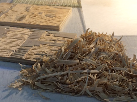
Shavings from one student's blocks.
Baren (on a beautiful baren pad), pigments, and a small stencil brush for printing.

We always learn from each other at Show And Tell at the end of the class.
First prints (underneath) were done with 5 plates, but the student decided to simplify and go with just three to make these appealing pink versions.

A nice use of "goma zuri" (speckling) in this background. Another plate with green pine needles was added later.


This complex design took a long time to carve, which unfortunately left little time for printing. This quick proof was all that the student was able to do. We all loved the soft edges of the clouds.

Broad areas of color characterize this abstract design. Even for an experienced moku hanga printer, it's difficult to get coverage this good.

Just a few of many variations that this student made with her four blocks.

A student who is very fluent in linocut did this nice loose carving in wood.
Nice subtle shading on the body of the bird and some loose carving, too.
This monoprint-style work was done by a student who was feeling frustrated with the finicky registration issues that her planned design required. Sometimes deviating from the plan is exactly what's needed.


Another nice use of goma zuri texture.

Zea Mays intern Kristina had some time to print a block she had been working on mokuhanga style.

As we left the studio, the skies showered us with pink and blue applause.

18 October 2015

Editions /Artists' Books Fair, 2015

I love Print Week in NY, and this year I'm excited to be one of eleven artists showing work with Zea Mays Printmaking at the Editions/Artists’ Books (E/AB) Fair, November 5-8. The E/AB Fair is New York’s annual showcase for contemporary art publishers and dealers, presenting prints, multiples and artists’ books. It coincides with its sister fair, the IFPDA’s Print Fair.

I'll be showing my Mixed Feelings prints and Secret Codewords of the NSA. If you're in NY for print week, come see Zea Mays at Booth #B54!

28 September 2015

Horizon


HORIZON
Watercolor woodblock print with stencils
26 x 38 inches (97 x 67 cm) on Gekko washi
edition: 2
___________________

The horizon is a circle that divideth part of the world seen from the part that cannot be seen.
– The New Book of Knowledge (1767)

All of the text for these prints thus far has come from Erra Pater: The New Book of Knowledge, a strange (at least to modern eyes) book that began as a perpetual almanac in England in 1535 but later became a compendium of folk wisdom.
The New Book of Knowledge was one of America's first bestsellers, undergoing at least 13 American printings between 1767 and 1810. The book includes an explanation of the relationship of zodiac signs to the parts of the body; a discussion of the four humors of the human body with folk medicine recipes; a section on fortune telling; and lore about weather, farming, and the care of animals. What's fascinating to me is that we think of the "Founding Fathers" as being enlightened and modern, but if The New Book of Knowledge is any indicator, they were not.

In the last few steps of this print, I added a dark blue bokashi at the bottom, printed the pensive fisherman in black, and added the text with a stencil.


As Donald Rumsfeld once said about our mission in Iraq, "There are known knowns. These are things we know that we know. There are known unknowns. That is to say, there are things that we know we don't know. But there are also unknown unknowns. There are things we don't know we don't know." We made fun of him for saying that, but it's pretty true. I like the video a lot:

24 September 2015

A Sea Monster

The next element for this piece is a sea monster. I don't know much about this monster, except that it's from the 1550s and possibly from France. I like how weird it is, with the funny long protrusions, the shark-like teeth, and the human-like eyes that seem to be going in the wrong direction for the rest of the fish. It was a bit of a chore to carve, because it's birch plywood and the image is about 2 feet long. Also my hands got very blue from the pigment left in the board from the last printing session.


If you squint you can see a couple of vertical areas of darker brown wood where I've carved. That darker colored wood was really hard, like knots are hard, and it dulled my tools almost instantly whenever I hit it. Annoying. But I kept on going, and then it was carved.

Today I printed again. The photo below is the result of 5 or 6 applications of color. I'll need to sleep on it before I decide if I need to add more color still or move on to the next step.


16 September 2015

Making Waves


 It's been almost two weeks since I've worked on my "Horizons" print. I had several client jobs, which is always a good thing, but it's hard to get back in gear on my own projects when they get interrupted. After I've been away for a while I have to get reacquainted with the project, and I often experience an odd feeling of fear. I guess it's a fear that I won't remember why I was doing what I was doing, or I won't be able to connect back up with the energy flow that I was in when I stopped.

But today I got it going again. As you can see, the print has progressed quite a lot since the last post. The color blue that's there now is a slow build of around 20 applications of color. I didn't count (it might be dispiriting), but because the paper is so thick I'm finding that I have much more control over a slow build of color than I would if I attempted to do it all in one shot.


Here's a closeup of the waves on the right side of the print. These patterns were cut as a reduction on the block and the darker marks were added with a hand-cut stencil. I did it that way because I'm committed to making this print with only one block.

Next up: some more carving.

04 September 2015

Second Color From Now On


Today I carved again and began working with the second color. You can see lots of gomazuri (speckling) here in this first blue layer. For me and my skinny arms, speckling is unavoidable at this size and with this very thick paper. By the time I've added all the layers that I expect to add, the speckles will disappear into an appearance of solid color.

The rest of the colors will be various shades of blue and I expect this will take quite a while to complete. More carving and lots of bokashi (gradations) are planned. Then there are the unplanned things…

But first, a holiday weekend!

02 September 2015

Musings On Birch Plywood

I'm starting the third very large print in my Almanack series, and I must admit I'm not a fan of birch plywood for moku hanga. But I'm also not a fan of paying $100+ for a sheet of the wood I usually use (shina) when I can have this birch for about $30. So birch ply it is.


Here's a shot of the entire sheet I'm working with. Because I find the carving so unpleasant, I've been adapting my ideas so that I need to do as little carving as possible. The area I've carved out will stay white (the color of the paper), so that happens first. The shape in the middle of the carved area is a "bridge," meant to hold the paper up so it doesn't sag into the carved area.


Above is a closeup of the carved area, with my hand for scale. You can see a void that was sitting just under the veneer, running horizontally just above my hand. Voids are awful if you're trying to do detailed carving, as the veneer above has nothing to hold on to. This is top grade plywood, so there's no way around encountering voids.

The orange color is the glue that holds the inner layers of ply together. It's tough and scratchy when the chisel goes through it and it dulls the tools quickly. If this were shina I would be cutting deeper, as shina plywood glue is soft and not really noticeable. Carving shina plywood feels like carving solid shina.


Here's an edge shot where you can see the plys and the orange glue. This is 1/2-inch birch ply.


This afternoon I printed the top of this block in a lovely pink.

28 August 2015

Rugby at Northern Print

Last year I got acquainted with Northern Print when my "Mixed Feelings" prints were shown at the International Print Biennale they hosted, so I was delighted when they got in touch to see if I'd be interested in participating in their new collaborative print project called "Scrum Down, Print Forward." As you can probably tell by the name, the project centers around the 2015 Rugby World Cup which is being hosted in multiple venues in the UK. This international print collaboration will attempt to break the Guinness world record for the world’s longest single linocut print, a record currently held by Kansas City artist Laura Isaac and colleagues. Once the lino is cut and pieced together it will be printed on Sunday 11th October in Newcastle upon Tyne by actual rugby players using a scrum machine as a kind of steamroller.

The panels for the 33 meter print (108 feet) were designed by UK illustrator Sara Ogilvie and are now being carved by artists from 11 print studios, representing the 11 UK World Cup host cities. You can see large views of these panels on the Scrum Down, Print Forward Facebook page.

Set within the design are 20 rugby ball shapes of lino, one for each of the competing nations. These will be designed by artists from each nation and I've volunteered to design the ball for the USA. Unfortunately, the deadline is too tight for me to receive the linoleum, cut it, and get it back to Newcastle in time for the event, so Northern Print has offered to do the cutting there based on my sketch. This is a new experience for me, to have studio assistants!

For my rugby ball image I wanted to do something American, but not too American (no statue of liberty or apple pie) and I wanted to make a comment about the American character but refrain from getting too political (which I am wont to do). I wanted the image to be light – maybe to make fun of us, but gently so. And I wanted the image to be strong and graphic and legible from a distance.

So I chose the fabled American Jackalope.

Along with the sketch, I sent this statement:
There’s nothing quite as American as a tall tale, and one of the best known U.S. mythical creatures is the jackalope. The word jackalope is a combination of two words: jackrabbit (a type of hare) and antelope (actually a pronghorn). First seen in the American west, jackalope are athletic, fast and aggressive. Willing to use their antlers to fight, they are sometimes called "The Warrior Rabbit.” Jackalope are difficult to capture, but occasionally you can catch one using whiskey as bait.
Not being much of a sports team follower, I have just this week learned that the U.S. men's national rugby team is nicknamed the Eagles. So may I say, "Go Eagles"!

And may I also note that I see something just a tiny bit Donald Trump in the way those antlers fall down over the rabbit's face. But there I go again…

12 August 2015

White Dude Fishing


 The next print in my Almanack series begins with this carving of a man fishing. The image comes from a book by Thomas Dilworth called A New Guide to the English Tongue, published in Philadelphia in 1770. It's a grammar and reading textbook and this picture, which I'm cropping and reproducing at a scale of about 500%, was used to illustrate a fable called "The Fisherman and the Fish" in which a captured fish asks to be released, promising that she (yep, the fish is female) will come back and allow herself to be caught when she's grown larger. The fisherman says no, and the moral of the fable is "Never let go a Certainty for an Uncertainty." I'm sure this is good advice for someone, but not for an artist.

I will be pairing this image with another quote from The New Book of Knowledge (1767):
The Horizon is a Circle that divideth the Part of the World seen from the Part that cannot be seen.
 As you may notice about these colonial era images I'm working with (it's impossible to not notice, really), almost all of the images feature white males. This isn't surprising given the context, but it makes working with the images take a certain direction. Although it wasn't my intention as I began these prints, whiteness has become one of the themes in this project.

06 August 2015

Lineage

From a triptych by Utagawa Kunisada
While reading April Vollmer's new book about mokuhanga, I noticed that when talking about an artist she would often mention that artist's lineage: where and with whom they studied. Lineage seems to be an especially strong concept in the east. For example, the form of meditation that I practice, which began in India, proudly traces a multi-generation lineage of teachers. Perhaps because mokuhanga was transmitted through a system of apprenticeship for most of its history, the role of the teacher/master is very important and students consider themselves to be lifelong students of their particular teacher no matter how adept they become.

So I got to thinking about my lineage. I learned mokuhanga from Matt Brown, a New Englander like myself, at a workshop here in Massachusetts. I call Matt my teacher, and will continue to do so, but the truth is it was a three-day workshop and that was the extent of my formal training. The rest I learned on my own and with some help from the online Baren Forum, started in the 90s by David Bull.

From a triptych by Utagawa Kunisada
Matt, too, is mostly self taught. He started making woodblock prints in the early 1990s and learned mostly through books, like Walter Phillips' Technique of the Color Woodcut. Matt cites David Bull, who is a mostly self-taught English-born Canadian living in Japan, and an artist named Bill Paden as people from whom he learned a great deal. Of Paden, Matt writes,
"Bill Paden died on August 6, 2004. He was a hanga woodblock printmaker from way back, having studied moku-hanga in Japan during the Sixties. He lived in New York City for many years and taught at NYU. He knew an enormous amount about hanga printmaking. He was a very generous personality and loved to share knowledge about hanga. He wanted to be sure we all did things the right way." 
Realizing that I might be able to trace my own mokuhanga lineage further, I got to wondering about Bill Paden and how he learned the craft, so I turned to Google. Bill Paden was born in Indiana in 1930 and lived in Japan from 1960-65. In Japan he met Clifton Karhu, another American from the midwest (Minnesota), who taught Paden mokuhanga. Since Bill Paden taught in New York, many current practitioners studied with him, including April Vollmer and Joseph Vorgity. (Joseph Vorgity and I are some kind of mokuhanga siblings, since we both studied with Matt Brown.)

Matt Brown, December Afternoon
So what about Clifton Karhu? The most thorough biography I can find is at the Verne Gallery web site. Karhu was stationed in Japan after WWII, left, was ordained as a Lutheran minister in 1955, then returned to Japan as a missionary and Bible salesman. He grew disillusioned with being a missionary in Japan (who wouldn't?) and relocated to Kyoto in the early 1960s, where he painted and then learned to make woodblock prints. The Ren Brown Collection web site has a wide range of Karhu's prints if you'd like to see some.

Bill Paden, Sunset
 Karhu seems to have been quite a character. He was known for the fact that he always wore traditional Japanese attire as well as for his woodblock prints, and the legend is that the Japanese said Karhu was more Japanese than the Japanese. As is often true of westerners who learn mokuhanga, Karhu chose to depict idealized Japanese subject matter in his work. An excellent and lengthy 1986 article from the Los Angeles Times quotes a number of Japanese artists critiquing Karhu's work:
"Karhu's technique is excellent, but it is essentially decorative," says Tetsuya Noda, a prize-winning print artist who combines photographic processes with woodblock printing. "When Americans get to like Japan, that's the sort of pictures they make." Hisae Fujii, curator of prints at Tokyo's National Gallery of Modern Art, agrees: "Karhu's pictures are good to look at when one is tired, but they do not stimulate us to look into the future."
Clifton Karhu
Not the most glowing reviews, but Karhu was very successful and sold a lot of prints. The only reference I can find about Karhu studying with any particular printmakers in Japan is in the LA Times article, which notes that gallery owner Tetsuo Yamada first pointed out to Karhu how well the bold lines and colors in his paintings would do as prints and taught him how to make them. More often cited as a mentor to Karhu is Stanton Macdonald-Wright, a California painter who ended up in Japan in the 1960s and taught Karhu color theory. So my mokuhanga lineage seems to stop at Clifton Karhu. I am amused, but not surprised, to discover that my lineage includes only western autodidacts like myself. And I notice with less amusement but no surprise that it only includes men.

And so I offer a hearty thank you to Clifton Karhu, Bill Paden, David Bull, and Matt Brown. I owe you! And if you have any further information for me on any of these artists, please let me know!

03 August 2015

Book Review: Japanese Woodblock Print Workshop by April Vollmer

Maintaining sensitivity to materials is the one essential key to using this technique successfully.
-April Vollmer

Three years in the making, mokuhanga artist April Vollmer's new book, Japanese Woodblock Print Workshop, is a comprehensive and beautifully illustrated overview of the process of making a Japanese style woodblock print. Compiled especially for use by creative artists outside Japan, the book contains chapters on the history of the Japanese woodblock print, an introduction to the tools and materials, step by step instructions, examples of contemporary work (including my own), and a comprehensive list of suppliers.

There are a couple of other English language books about mokuhanga that are already available, most notably Rebecca Salter's 2001 book Japanese Woodblock Printing and The Art and Craft of Woodblock Printmaking (1999) by Kari Laitinen, Tuula Moilanen, and Antti Tanttu. Both of these books offer excellent and thorough discussions of technique and should be part of every mokuhanga printmaker's library. What Vollmer's book provides, however, is a particularly American approach that resonates with my own teaching and working style. She presents an art form that is traditional and laden with historical and cultural complexity and makes it approachable and accessible for artists outside of Japan who do not have the luxury of studying with Japanese masters and who are more familiar with Western printmaking. Vollmer always describes the Japanese way of doing things, but she then offers workarounds if the materials are difficult to find where the artist lives and works. As she says in the book's introduction, it is "written with the belief that this flexible technique can be adapted for use by individual artist-printmakers. With experience, artists can develop an approach to woodblock printing that reflects their particular situation, technical ability, and available resources."

A photo spread introducing the ever-important element of rice paste in Japanese woodblock printing.


I like to say that mokuhanga is simple but not easy. I compare it to learning a digital drawing or painting application, such as Illustrator or Photoshop: an artist can usually make something satisfying on the first attempt, but it can take many years to truly master the program and many artists never take full advantage of all the possibilities. Mokuhanga is like that, and Vollmer highlights the elegant simplicity of the method, thus making the technique accessible, while inviting us to step into a deeper relationship with it by touching on the complexities and myriad possibilities, both in words and by showing inspiring examples of work by contemporary artists. 

Japanese Woodblock Print Workshop is a wonderful book in which I'm proud to be included, and which I will be recommending to my own workshop students. It's available from most booksellers and also from McClain's Printmaking Supplies.