Dear readers.
I'm moving my blog!
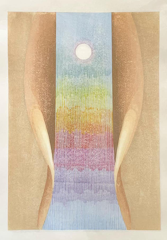
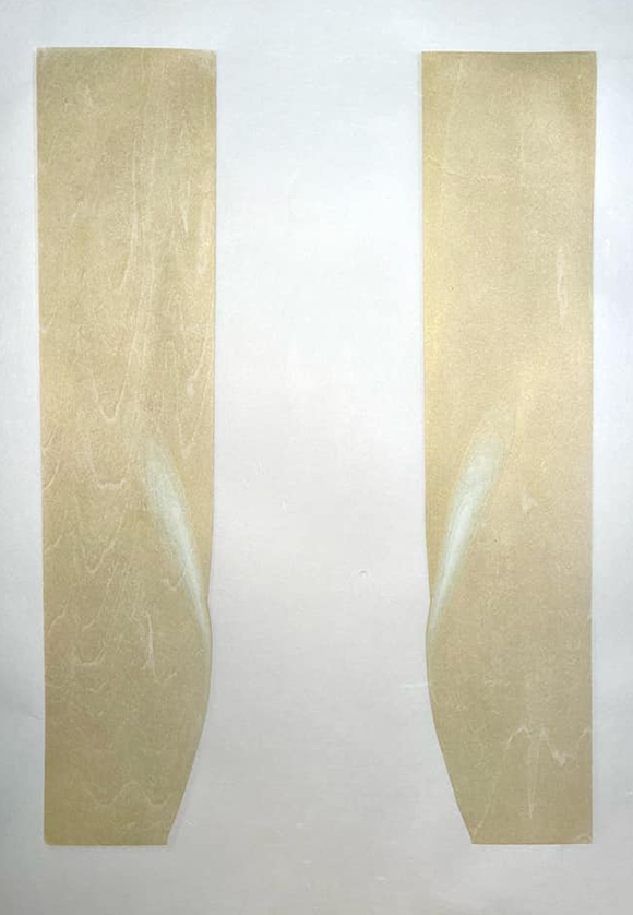
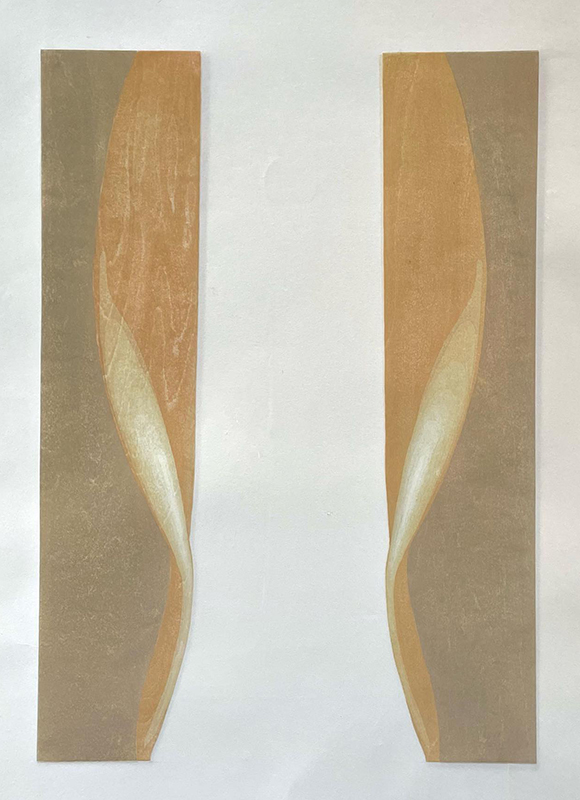
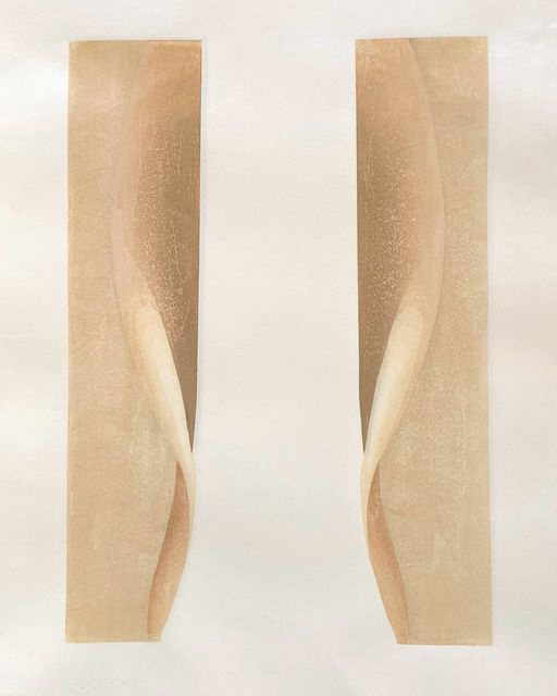
It's been 19 years since I started Woodblock Dreams blog, and there are over 900 posts here. It's a valuable collection of ideas, trials and errors, tips, tricks, and comments from others that developed as I learned how to make mokuhanga prints. I still come back to it as a studio diary, to help me remember when I did certain work and what I was thinking at the time.
And now it's time for me to make a fresh start. I'll leave this blog up because I've loved it and I think there are some folks who have also loved it. No reason to take it down.
But if you'd like to follow me on my new blog, the address is:
https://anniebissettblog.wordpress.com
I'd love to see you there! Thank you for being here.